Who am I?
Hello readers, my name is Lily and I am currently a second year student at Oxford Brookes University studying Publishing, Journalism and Media. Originally from a small town in Hertfordshire I was never quite use to the hustle and bustle of the city till I came here. I feel Oxford and the university gives me so many new opportunities (writing this blog being one of those). I aim to make my articles as interesting and relevant as possible whilst adding my own personal flair to my writing style. I hope they bring you as much joy as it has for me writing them.
My Blog Thoughts and Ideas
Initially I was very puzzled as to what I should be writing about. I knew it had to link to typography nut linking one of my passions to this as a theme was proven to be a challenge.Then it hit me…FOOD. Ever since I was little I have always been extremely passionate about food whether that be watching my grandma bake or trying out recipes myself. I am not gifted at cooking by any means but it is a huge stress reliever for me.
Through my articles I want to discover the different types of typography for food brands and how current events in the world are changing the food brand logos and fonts. It will be a unique persepctive but hopefully extremely interesting.
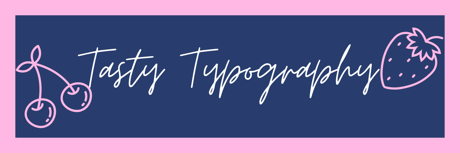
My Logo
![]()
My Logo was created solely using Canva however drew pictures for inspiration beforehand. I decided on the name ‘Tasty Typography’ purely because I believed it sounded intersting with the alliteration and links into my theme of food.
The colours for the logo are very bold and perhaps even a little feminine. With both blue and pink being my favourite colours I feel like it is heavily linked to my personality and personal preference. The shade of pink used is ffb7e3, which is one of the lighter pink shades. Pink as a colour was first used in the late 17th century and is often stereotyped to be a ‘girly’ colour due to the floral connotations it holds. It further explores themes of love and inner peace which exactly how I feel when I cook. Blue, on the other hand, is genderized to be very masculine. I decided upon using a rather dark shade of 283D6D. It brings around a calming effect to the reader with a hint of mystery.
The actual font on the Logo is that of Moontime. It has a very free-spirited feel to the text with curved lines. It reminds me almost of a handwritten letter. The brightness of the font colour of white also attracts the readers attention far more than other shades or colours.
I decided to also add an image of a strawberry at the bottom of the page. For me this is a sweet touch that refers to the theme of my blog. Who doesn’t like strawberries!
My Banner
Like my logo, my banner too was made using Canva with the two heavily linked as both had the same font and image style. I made this decision as I believe it looked far neater on the page.
By having the whole phrase ‘Tasty Typography’ shown on the banner it is far easier to see the prettiness of the moontime font and the style gives of exotic, french emotions with the curved edges of the letters as they join to one another.
I included basic images of a strawberry and a cherry in pink. This enables them to stand out more yet the simplicity of the images make them easier to see. The two fruits are also my favourites so by adding them it is a personal touch.