For years food brands have been hiding symbols from us. The tactical marketing move is utterly brilliant and totally different from most brands on the market. Here are a few of those logos with some design secrets that will shock you all.
TOBLERONE
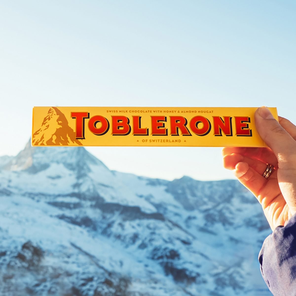
First developed in the Swiss town of Bern in 1908 the chocolate has become one of the most loved chocolates in the world. Legend has it that the town of Bern owes its name to the furry creature. The logo cleverly is associated with this by having a bear hidden in the mountain.
TWIX
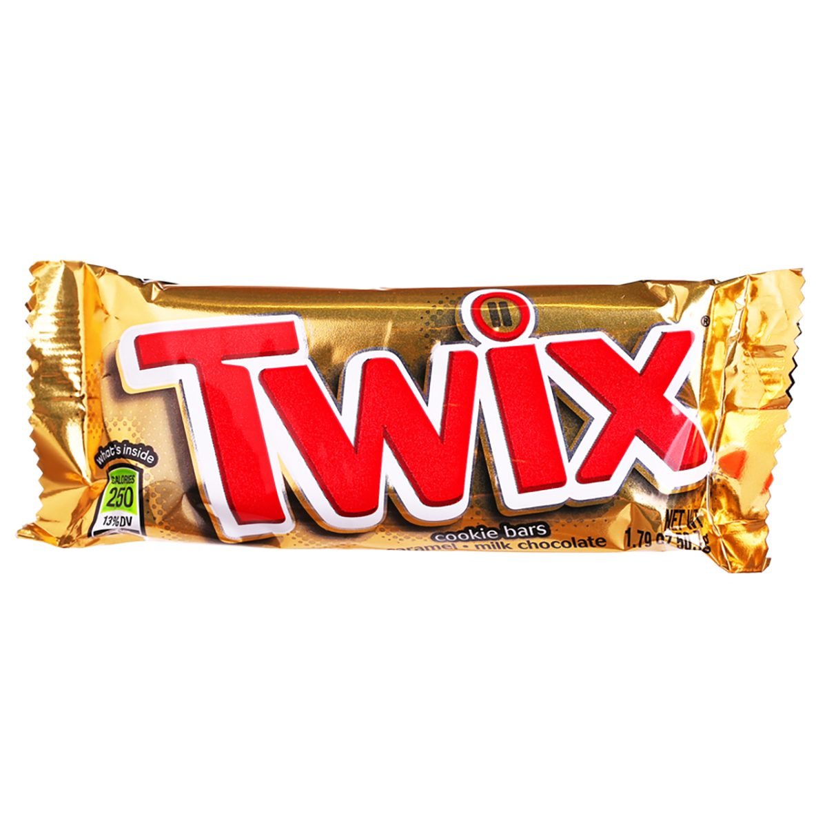
If you look closely you will notice two very small Twix’s upon the I. This secret message is supposed to highlight the famous left and right Twix campaign. The campaign brought huge controversy over whether consumers choose to eat the left or right Twix first.
MCDONALD’S
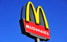
The famous food brand logo has a very naughty message. It has been rumored that the two M’s joining together supposedly highlights the maternal mother’s breasts. This saucy marketing strategy is used to portray how the food at McDonald’s is better than home-cooked food.
PEPSI
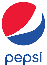
Pepsi’s logo is actually meant to visualize the earth’s magnetic field. This indicates how the consumers themselves are attracted to buying and drinking Pepsi much like a magnet themselves.